Ok, since I no longer have access to Dreamweaver, I'm going to post my final project from my Experimental Media class here. It's mostly experimental in its concept, not particularly so in its execution. The basic idea is an infinity of dresses being taken off one after the other; like a never-ending set of repetitive actions that are just different enough to notice. I'm sure I could have done more to make this better, but I honestly ran out of time. Animation is a lot harder than I thought it would be (which is saying something because I was afraid of how much time it would take before).
I had planned on having more color variations to cycle through, but once I realized how long it would take to make them, I switched to using only primary colors.

Friday, December 16, 2011
Friday, May 6, 2011
Art Event Review - Diana Abells' SMP
I went the other SMP's, and of the other three, Diana Abells' interested me the most. She talked about wanting to show the connection between art and physics, through the human form. She started out drawing photos (in series' ) which were elaborately constructed to convey concepts of physics. During the midyear critique she realized that motion was too vital to her ideas for her still images to be right. She switched to film to capture the motion of the human body, and stopped trying to imitate physics concepts. She started creating videos of the human body's normal movements.
The drawings she did convey the natural extent of the body's range of motion. Some of the images look as though the joints are bent as far as they will go, suggesting a strain on the body. The strain implies that there is something stopping the body from moving farther, namely physics. This is a bit of a stretch, but I already knew her purpose so it's a little hard to just look at the images.
Personally, I think her work connects more closely to movement than it does to the physics behind movement. I haven't actually taken an up close look at her work yet, but it doesn't look like it explicitly screams "physics!" It feels more like a study of the characteristics of motion than a connection between the artistic qualities of motion and the physical properties that cause it. I have no idea how she could fix that, since i'm assuming she doesn't want to explicitly express the concepts of physics she is working with.
Art Event Review - Tara's SMP
I went to the Saint Mary's Project studio art presentations on Tuesday. The second one, Tara Hutton's, was particularly interesting to me. She talked about her work with making dolls (both virtual and paper). She mentioned drawing inspiration from Felix Gonzalez-Torres, who creates interactive sculptures out of various materials (including candy) by placing piles of the material in the gallery that weigh the same as his lover who died of AIDS, and invites the viewer to take the material. She said this interactivity spoke to her because it made the audience a necessary part of the work. She also talked a lot about the flash games she created, in that they make the audience much broader than just the gallery-going minority who can interact with her physical dolls.
The issues of class, race, body type, sexuality, and gender she presents in her work all point toward a very clear message: we are all essentially the same. The move to a broader audience is a step in this direction as well, but as she told us, it isn't quite universal yet. The use of a children's toy makes the message even clearer, bringing the participant back to a more innocent state of mind, in which they are more able to receive the message.
I hesitate to say anything bad about her project, mostly because i know she's going to read this, but there is one thing that bothers me a bit. Dolls in any form are so distinctly a girls' toy. I think this alienates boys to some degree, especially ones who aren't comfortable with the other issues involved. I'm not sure there is a way to avoid this, but i think it's worth thinking about. The only comparable thing i could imagine is having an action figure that moves, but that's stereotypical in the other direction. I'm interested to see where Tara takes this from here!
Tuesday, April 5, 2011
Pocket full of memories

The Pockets Full of Memories Project was a collaboration between Dr. Timo Honkela, the C3 Center for Culture and Communication, Projekttriangle, Dr. Brigitte Steinheider, Andreas Schlegel, and CREATE lab. it was shown in the Centre Pompidou (Paris) in 2001. The project was interactive, allowing the viewers to scan objects with them into a database from which the computer selected 280 images and grouped them on a screen based on the descriptions viewers provided with the items. the algorithm continually reorganized the map based on the new scans and the descriptions provided.
The project deals with memory in an interesting way. It is a visual representation of the connective way the human mind processes memories, based on the way we think of them. For instance a hand might be placed next to money or keys since you use hands to carry them. This suggests that memory is not a temporal function but a relational one. The constant change of the images in relation to each other implies an ever changing mental slew of relational connections.
I think the only suggestion I have that could have made it better would be to have more of a web-like structure for the production. The grid of squares suggests an ordered connection, which the objects don't really agree with; they imply a more random connection.
Source:

Tuesday, March 1, 2011


Thursday, February 24, 2011


Tuesday, February 22, 2011
Alexis Rockman

Alexis Rockman had an exhibit at the National Portrait gallery when we went as a class a few weeks ago, so I decided to use him for my artist blog post. His work revolves around themes of environmental hazards and post-apocalyptic worlds. The image above is called East 82nd Street, depicting the total take-over of an urban setting by futuristic looking plants.
The actual painting has very visible drip marks from the paint, which is caked onto the surface of the piece. This really accentuates the idea that the plants have grown over something that was there before. There is a glaze over the entire painting giving the plants an almost futuristic shine on them. The flies and the flower are the only part of the piece that are not red; this leads the viewer to the conclusion that there is a small amount of hope in the outcome, even if that hope has no place for any animal larger than a fly.
The only suggestion I can think of to better the piece is to make the plants (some of them) look more like they are crawling over things, rather than hanging off of them. It would make the invasive, harmfulness of the red plants more apparent.
Source: Alexis Rockman
Thursday, February 17, 2011

Monday, February 14, 2011

Tuesday, February 8, 2011
Image Retouching
This is the original image:

And here's my retouching of it:

Same deal, here's the original:

And the retouching:

This is a picture my friend Suz took of me and Steph (and her dog Tonks):

And here's my retouching:

Thursday, February 3, 2011
Olia Lialina
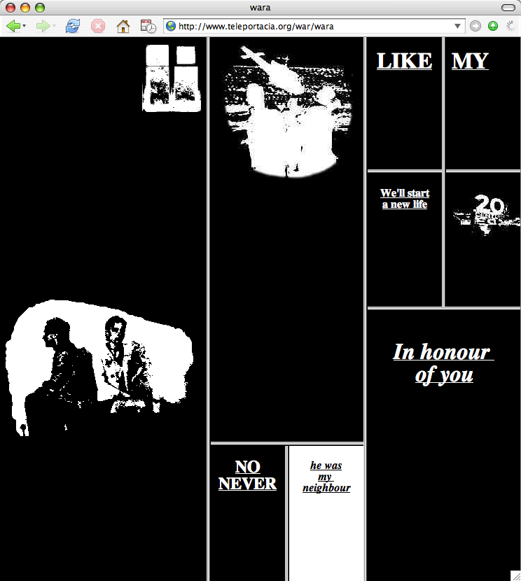
Olia Lialina’s project My Boyfriend Came Back from the War (MBCBFTW) is a website with a series of hyperlinks leading the viewer through an interactive story. This story follows the conversations of a woman and her boyfriend, who returned to her after fighting in a war, but does so in a fragmented way. The hyperlinks lead the viewer through pieces of their conversations, at the viewer’s discretion. All possible paths lead to the same end result, a black background cut into rectangles with a drawing of a man and an animation of a window on the right. It is hard to figure out what has happened between the two people, but eventually it becomes clear that the woman has cheated on the man while he was gone.
The couple clearly has issues relating to each other after both the war and the cheating, which show through in the fragmentation of the page as the viewer progresses deeper into the situation. The ability of the viewer to move between links at his/her own discretion implies that the woman and her boyfriend have trouble communicating; they try at different times and at different rates of speed, as well as talking about separate subjects at times. The element of time involved in the hyperlinks, suggests that no matter how long they try to come to terms with their inability to communicate the end result will be the same.
I found that when the screen first gets split into boxes, the viewer can manipulate them by dragging the boundaries of the boxes to shift the dimensions or even hide certain boxes. This adds to the idea that the woman and her boyfriend are on unstable grounds. The spaces that make up their thoughts and feelings can be hidden from each other (as well as the viewer) and they can be diminished or multiplied. The most interesting aspect of this manipulation is the effects it has on the two images that remain present the throughout the site. The image of two people, presumably the woman and her boyfriend, remains the same despite the manipulation, while the animation of the window gets bigger when the side with the smaller boxes is pushed against the edge of the browser. The window gets smaller as these boxes are stretched across the space. In this case the window could represent their freedom from the issues plaguing them, which is reduced to almost nothing when these issues dominate the space. The people remain the same despite the changes, suggesting that they will remain not only when the issues disappear, but even when this freedom fluctuates.
The only suggestion I can think of to improve this project is to make it more clear which person is connected to each piece of text and picture. The lack of clarity detracts from the attention given to the rest of the work.
Sources:
Tuesday, February 1, 2011

Monday, January 31, 2011
"Sneak Attack!!"
This is my collage, from the scans my classmates posted on their blogs. I've decided to call it "Sneak Attack!!"

Exercise in Photoshop from class
This is the collage I made in class on Thursday, and finished just now. I bet you can't find the three things I inserted! Actually I bet you can; that's the point of putting them in there...

Wednesday, January 26, 2011


Monday, January 24, 2011
Artist blog: Charles Cohen

Charles Cohens series Buff consists of images of porn with the people photoshopped out. The people are often recognizable both as human and by their sex from the outline created in their absence and the poses are frequently so sexual that it is hard to misconstrue them, even without the aid of contextual clues in the background. These images focus on the backgrounds, which are the only source of color and also more of a foreground than the cut-out people are. This series relies on the recognition of this type of image by the audience as well as the connotations the type carries with it to inform the work. The series’ meaning is derived from the audience’s preconceived ideas interacting with the image presented.
That being said, I found this particular image to be the most interesting of the series. First, the negative space part of the image is not clearly human; to me it looked more like a weird octopus-like creature. Upon further inspection, it becomes more human in appearance, but still remains slightly abstract. This adds to the theme of dehumanization, which is apparent in the complete removal of humans from the image. The dehumanization acts in much the same way as it does in porn without the people cut out of it; the porn industry removes the individual from sex, both in terms of the subject of the image and the viewer. The removal of the pornographic image removes the only thing that people want the images for; they certainly don’t look it up to check out other people’s home décor.
The essentializing of the porn into its most basic is not singularly associated with this topic; it has the same dehumanizing effect in the way the Western world views the Eastern world and vice versa. In my Southeast Asian philosophy and religion class today we talked about how when the British colonized India they re the many different reduced the many religions of India into a singular set of beliefs which were dubbed Hinduism. This reducing of things into their most basic qualities has been going on for centuries and hasn’t changed with the advent of digital technology. Cohen flips this reductionist idea on its head by removing the only essential part of the picture.
Another interesting aspect of this image is the use of femininity. Every image in the series of a single person is a woman; there are no solo guys. I will admit that this could just be because the artist is male, but it still warrants mentioning. The female figure is particularly prone to being dehumanized in many art forms (visual and otherwise) as well as in the media and until recently through the lack of legal rights; Women gained suffrage less than one hundred years ago. As far as the issue of homosexuality is concerned in this particular image, the dehumanization of this type of image represents a broader kind of inhumanity associated with homosexuality by its opponents. The controversy surrounding the level of humanity present in people of this persuasion is still highly charged, as I’m sure everyone is aware, but to put it in context, it was only in 1973 that homosexuality was officially removed from the Diagnostic and Statistical Manual of Mental Disorders (DSM). (see link)
One major strength I see in Cohen’s series is his diversity in original images. The idea that no matter the starting point, the end result will be the same is a powerful one. Several of the images include a body only partially represented and cut off the edge of the picture plane, while others include multiple bodies framed entirely within the image. The images come from both sexes (with the exception of the lack of single men) and are set both indoors and outdoors with various objects surrounding the negative space.
On the whole I find Cohen’s Buff series to be both culturally enlightening as well as philosophically relevant to the question of where pornographic images fit into society and where the line is drawn to define an image as crude.
Sources:
http://www.promulgator.com/
University of California, Davis
Wednesday, January 19, 2011
The Youtube Experience
I was required to make this blog for my Intro to Digital Media Art class. When I looked at the pages of last semester's student blogs for the course, I was a bit astonished. Most of them were titles with the course number and (at least at first glance) appeared to strictly focus on digital art in a traditional sense. The phrase traditional sense strikes me as a little irrelavent to this particular aspect of life though, so I've decided that my blog, from the start, will be much different from the cookie-cutter ones I saw. First of all, I've let the design of the page stray fairly far from the topic, as I'm sure you can see (and I'm sure it will change periodically). Secondly, I want to describe for you my experiences with this class and more generally with digital media, so expect to see references to anything from Harry Potter to Southeast Asian philosophy to Austin's Emma. I will find a way to connect it all.
For my first entry, I'll stick to what we discussed in class on Tuesday. My professor showed us part of a video about the anthropology of Youtube. Over the course of the discussion, a thought occured to me; I have gotten so much of my identity either directly through the internet, or through routes similar in nature to it. My vocabulary naturally includes verbs like google, tweet, and download as well as acronyms like LOL & FML and symbols like less-than-three. A great example of this sort of viral communication becoming ingrained in people and becoming essential to their personalities comes from a personal anecdote. Last summer, while hanging out with a group of friends, one of them insisted that I listen to a song she had on her iPod. After hearing it, I was entranced; The Midnight Beast quickly became my new favorite band and I have since liked them on facebook and seen all of their Youtube videos. The interesting part comes when i mention that these three guys are from the UK. They started out with nothing more than a single video for their parody of Ke$ha's "Tik Tok," which they posted on December 9, 2009; by Christmas of the same year, the video was featured on Youtube's main page, and it now boasts an impressive 9,961,858 views.
My friend, it turns out, had heard the song from one of her friends, who discovered it via one of her friends, and like so the voyage of this tiny 3 minute 44 second long video made it's way across the Pond and through the iPod speakers into my ears. My love of The Midnight Beast followed suit when i clicked the links to their other videos. Their not-so-subtle humor and catchy coreography has become fairly important to the way I behave on a daily basis. I have even begun to use the word "ninja" as an adjective in daily conversations as a way of saying "really good," thanks in part to their video Ninjas, even though they maintain its noun-ness in the song. The band currently has 245,491 likes on facebook, not counting the numerous non-official pages in their honor. Their newest video was uploaded to Youtube 14 hours ago and already has 22,539 views.
The digital landscape is running over into the real world in many ways, and necessarily in a bad way. It changes us forever - there is no taking it back once it's out there - but change is a double-edged sword; there are upsides and downsides chasing eachother all over the place and it's not our job to command them, only to take them for what they are and run with it.
Subscribe to:
Posts (Atom)