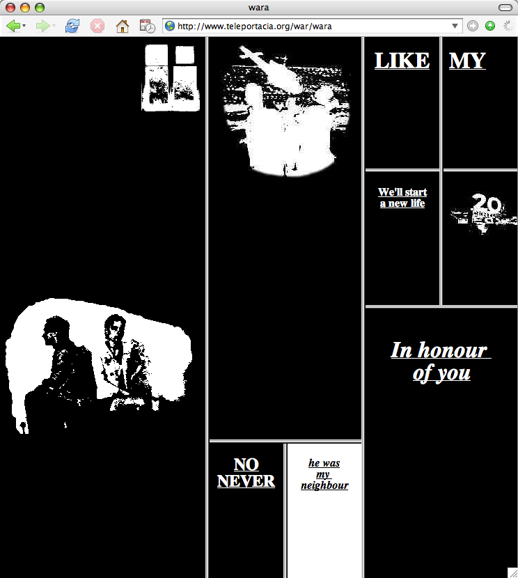
Olia Lialina’s project My Boyfriend Came Back from the War (MBCBFTW) is a website with a series of hyperlinks leading the viewer through an interactive story. This story follows the conversations of a woman and her boyfriend, who returned to her after fighting in a war, but does so in a fragmented way. The hyperlinks lead the viewer through pieces of their conversations, at the viewer’s discretion. All possible paths lead to the same end result, a black background cut into rectangles with a drawing of a man and an animation of a window on the right. It is hard to figure out what has happened between the two people, but eventually it becomes clear that the woman has cheated on the man while he was gone.
The couple clearly has issues relating to each other after both the war and the cheating, which show through in the fragmentation of the page as the viewer progresses deeper into the situation. The ability of the viewer to move between links at his/her own discretion implies that the woman and her boyfriend have trouble communicating; they try at different times and at different rates of speed, as well as talking about separate subjects at times. The element of time involved in the hyperlinks, suggests that no matter how long they try to come to terms with their inability to communicate the end result will be the same.
I found that when the screen first gets split into boxes, the viewer can manipulate them by dragging the boundaries of the boxes to shift the dimensions or even hide certain boxes. This adds to the idea that the woman and her boyfriend are on unstable grounds. The spaces that make up their thoughts and feelings can be hidden from each other (as well as the viewer) and they can be diminished or multiplied. The most interesting aspect of this manipulation is the effects it has on the two images that remain present the throughout the site. The image of two people, presumably the woman and her boyfriend, remains the same despite the manipulation, while the animation of the window gets bigger when the side with the smaller boxes is pushed against the edge of the browser. The window gets smaller as these boxes are stretched across the space. In this case the window could represent their freedom from the issues plaguing them, which is reduced to almost nothing when these issues dominate the space. The people remain the same despite the changes, suggesting that they will remain not only when the issues disappear, but even when this freedom fluctuates.
The only suggestion I can think of to improve this project is to make it more clear which person is connected to each piece of text and picture. The lack of clarity detracts from the attention given to the rest of the work.
Sources: